Centro Case Study
Building a design system for iOS to connect world language educators
Intro
Project duration: 8 weeks
My roles: UX Design, UI Design, Product Design, Prototyping
Client: Personal project
Brief: Inspired by the critical shortage of World Language teachers in the United States, I set out to create a design system that can be implemented to help teachers share resources and support one another through an online network, saving time and thus reducing burnout. To encourage widespread adoption, I chose to ensure the design system was comprehensive and versatile enough to see use outside of the EdTech sphere as well. The completed design system would include a statement of design principles, a style guide, screen layout templates, design tokens, and an array of customizable components.
Objectives
⭐ Build a design system for iOS and web to serve both EdTech design teams and their audiences.
⭐ Ensure it’s modular, responsive, and adaptive enough to be implemented outside of EdTech as well.
⭐ Develop and implement brand guidelines within the design system to facilitate its adoption.
View the finished design system or continue on to read the case study
Ideation & Planning
As a designer with five years of experience teaching world languages, I know firsthand how much effort educators put into creating and implementing their teaching materials. Finding resources that match a district's standards can be tedious and expensive, even with the abundance of materials available online. The effort spent designing lessons, exercises, and assessments on top of teaching, coupled with stagnant pay and difficult teaching conditions, is contributing to to the ongoing burnout crisis among teachers in the United States.
I envisioned a service that could tap into the vast amount of work that teachers have already devoted to building their materials. I wanted to help make it easy for teachers to share and download teaching materials within their school district, provide constructive feedback, and commend their peers’ hard work. I have been interested in delving into building a design system for a while, so this was the perfect opportunity to lend my help by creating a design system that could be used for connecting teachers and more.
It was important to define specifically which issues the design system would target before beginning to build its components, as I wanted to ensure its style and components would be as ready as possible for real-world application when finished. After researching and reflecting on my own teaching experience and that of my peers, I constructed a problem statement.
Problem Statement
When language teachers in the U.S. seek to obtain the materials they need to deliver successful language instruction, they expend a great deal of time searching for, adapting, and building the materials themselves in order to ensure their quality and alignment with their district’s curriculum requirements. This leads to teachers overworking themselves outside of instructional time, contributing to dissatisfaction and long-term burnout.
If teachers could easily collaborate and share resources with other language teachers who must adhere to the same learning standards, they would save time preparing lessons and materials, feel supported by their peers, and be able to focus more on delivering instruction.
With a problem statement in mind, I defined the primary goals that would inform my design vision. The finished design system should:
✔️ Save teachers’ time by connecting them to the teaching materials they need
✔️ Foster a sense of community between teachers by encouraging mutual support
✔️ Improve the quality of teaching materials by facilitating constructive feedback
With a vision of how my design system could make an impact, I began to delve into the specifics of what elements it would need to include. I wanted its components to be easily responsive and adaptable for a diverse set of contexts and content types, so I researched various design methodologies that would facilitate that goal. I consulted Alla Kholmatova’s Design Systems book for a general overview of how to begin building, and researched Brad Frost’s Atomic Design methodologies and Sophia Prater’s Object-Oriented-UX approach for more specifics on how to ensure my design system would be future-proof and easy to implement.
Choosing an object-oriented approach to UX planning in particular was extremely helpful for conceptualizing how the design system’s pieces would relate to one another, giving me a top-down view of what elements each screen and component would require early on in the design process. I also found it encouraging that an OOUX approach would make it easier for my designs to be implemented further down the line by backend engineers.
I began by specifying the design system’s intended goals and functionalities, then extracted the objects from my writing.
Defining Objects & Interactions
Step 1 - Extracting objects from goals
Next, I defined the core-content of the objects and nested the elements within each other to define how they would be cross-linked. After that, ranking the importance of each element and inserting calls to action helped me to define the visual hierarchies that would guide my design process.
Steps 2 & 3: Defining Core Content and Cross-Linking
Steps 4 & 5: Forced Ranking Calls to Action
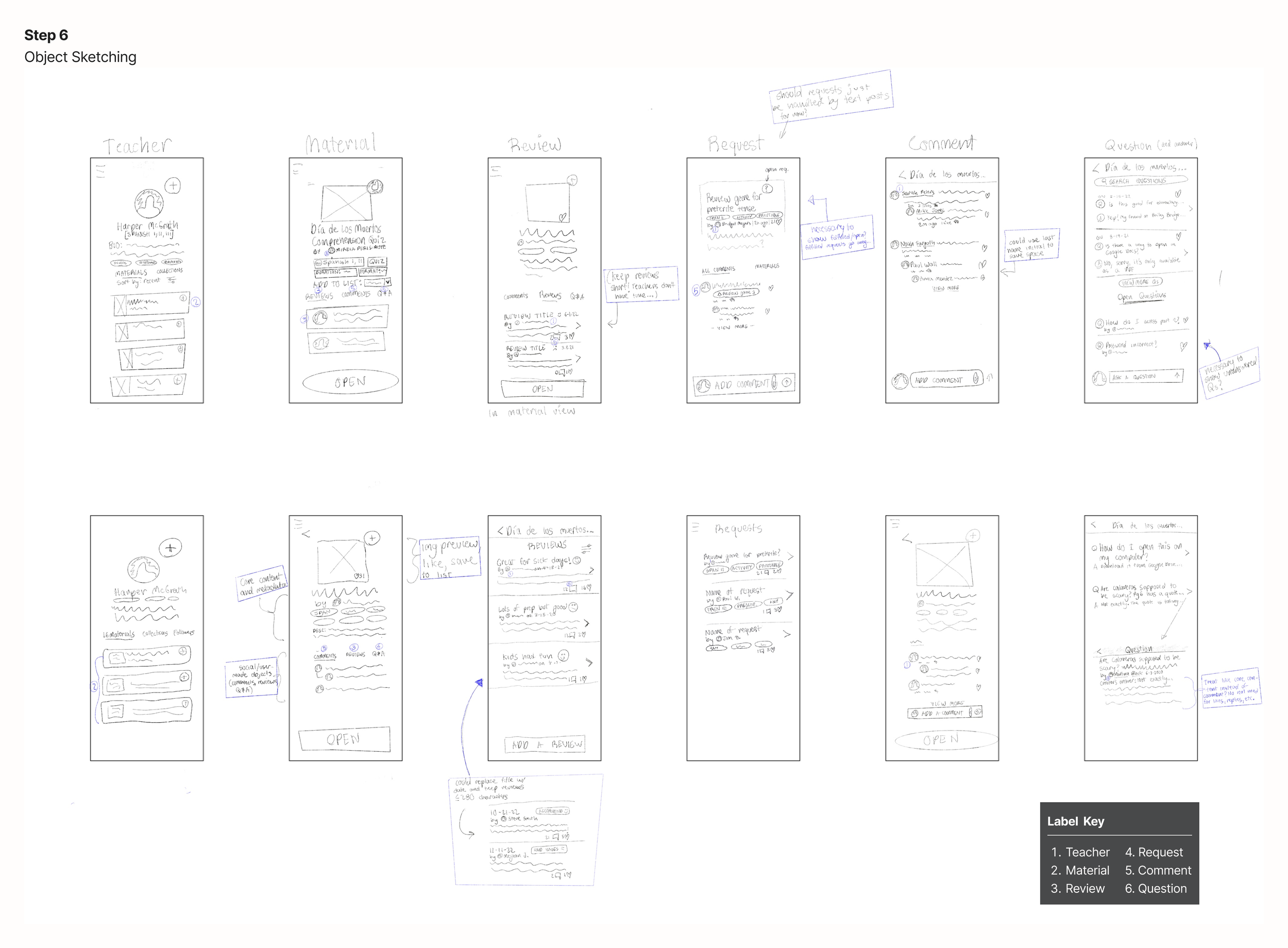
Diverging slightly from Sophia Prater’s standard OOUX process, I added the additional step of sketching out how each element could be presented on screen. This helped me to have a more concrete understanding of how they could look and interact with one another.
I focused on sketching mobile layouts, as it is usually easier to scale them up to web layouts than vice-versa. This then led to several changes to my object map, as I had a better concept of the effort it would require to design and implement each element.
Finally, in the interest of thoroughness, I created a user flow diagram using the calls to action from the revised object map. I wanted to be sure I was considering all the design patterns that might help my audience find resources and interact with one another. In the process of diagramming, I also included some new actions.
Now that I had a metal map of the service’s potential structure and affordances, I was ready to delve into the specifics of how they would be presented. I began to explore the patterns that would make up my design system.
Step 8: Mapping User Flows
Exploring Design Patterns
Instead of building components individually, I fleshed out the screen sketches into high-fidelity wireframes to give them context. This allowed me to explore which visual styles were most effective and appealing, discover which functional and perceptual patterns worked best for each flow, and check for consistency throughout my designs.
Although I wireframed for both iOS and web, I elected to focus on the iOS platform first in order to proceed more efficiently. Designing for a single platform helped me to ensure components were as versatile and modular as possible, and it afforded me more time to explore their variants, instance swaps, and style treatments. Because I wanted screens to load quickly, utilizing different system fonts for each platform would also make spacing and styling time-consuming to keep in sync between the platforms. I planned to return to building the desktop version of Centro once the iOS design system was complete
Home and Profile web wireframes
Home, Profile, and Material iOS wireframes
These screens would see several revisions to make them more readable, reduce clutter, and ensure visual consistency with one another. One of the biggest challenges was making user and material metadata easy to visually parse so that teachers could quickly define and find what they were looking for. Consulting my object map helped me decide what information was most necessary to highlight on each screen and what could be de-emphasized or hidden in the interest of clarity.
In the process of iterating on my wireframes I added interactions and animations to link them into interactive prototype. This brought my design vision into greater focus, letting me test how the elements would operate in tandem. Having a proof of concept gave me confidence in my design direction.
Medium-Fidelity Prototype Demos
Creating an account
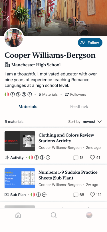
Exploring materials and profiles
Uploading a material
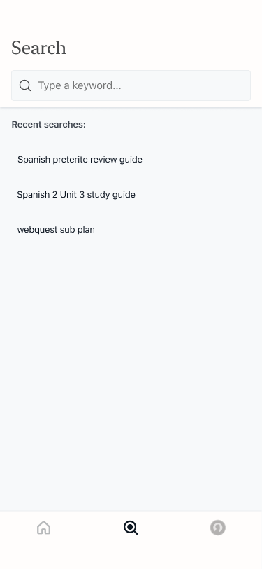
Navigating home, search, and profile
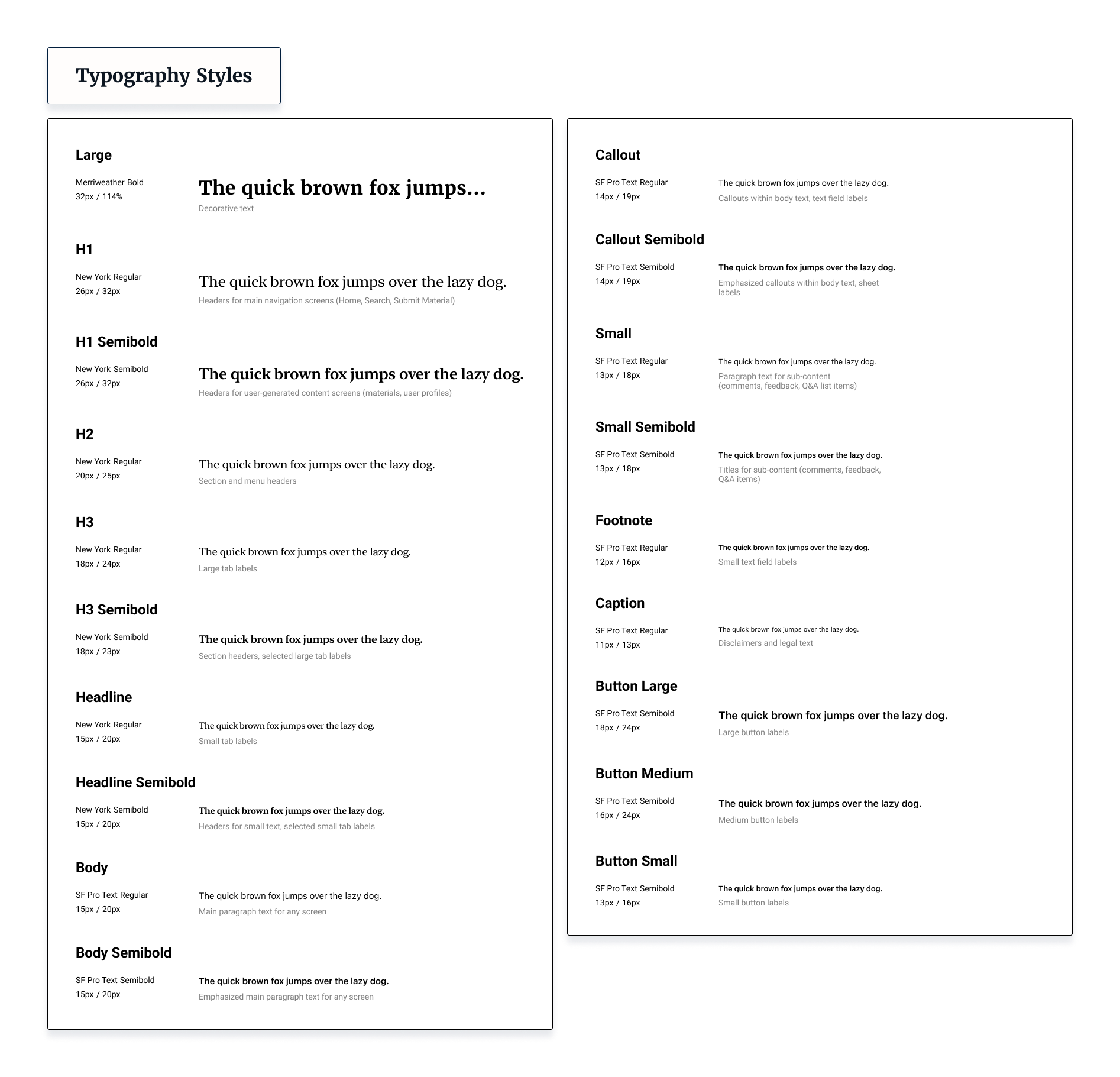
This is where the perceptual patterns of Centro began to cohere. As in many products that rely heavily on user-generated content, I settled on using color sparingly in my UI to keep the focus on images and artwork. I used system fonts exclusively to ensure pages would load quickly, a priority of my established design vision.
In the same spirit, I focused on creating minimalist designs with an above-average amount of white space. I hoped avoiding bright colors and large text would provide teachers a calm, professional, and distraction-free space to plan.
Choosing subtlety over visual flair also helped me make my design system modular, as it was it easier to combine its elements into matching configurations. I wanted to ensure it could be easily adapted for use outside of just the EdTech service I had envisioned.
Revised Home, Material, and User Profile Screens
Building the Design System
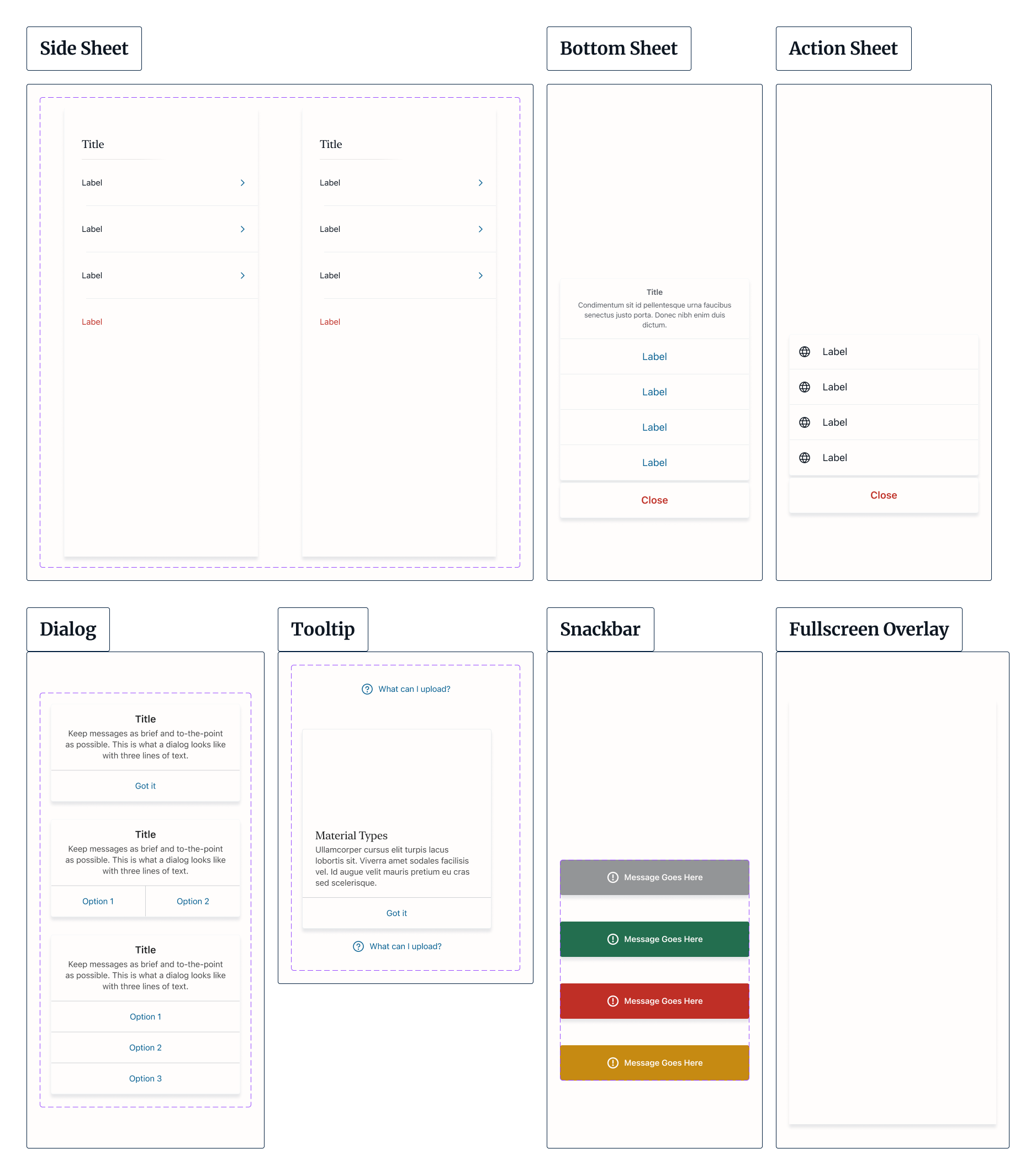
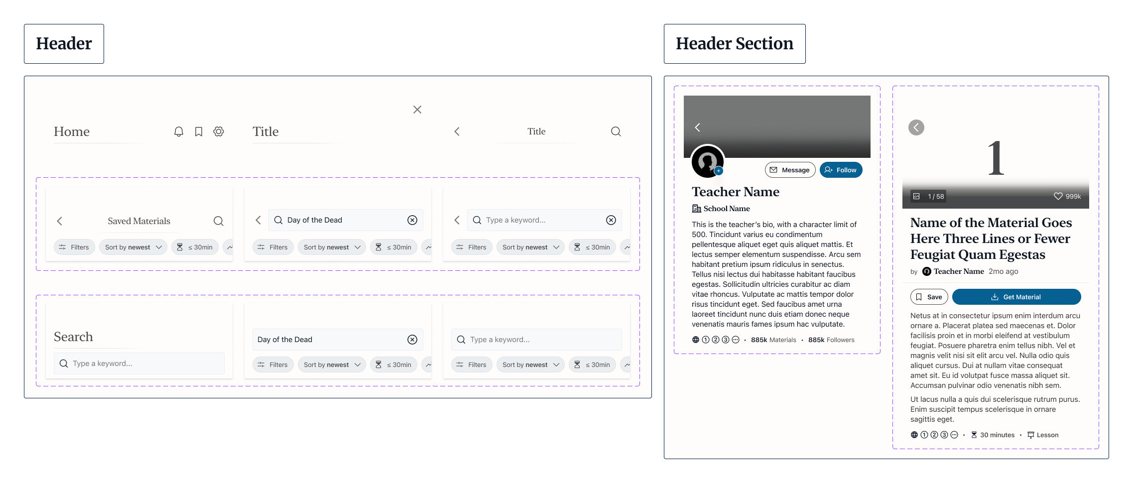
To assemble the design system, I conducted an interface inventory to break the screens down into distinct modules (what Atomic Design refers to as organisms), smaller components (or molecules), and foundational elements such as icons and images (atoms).
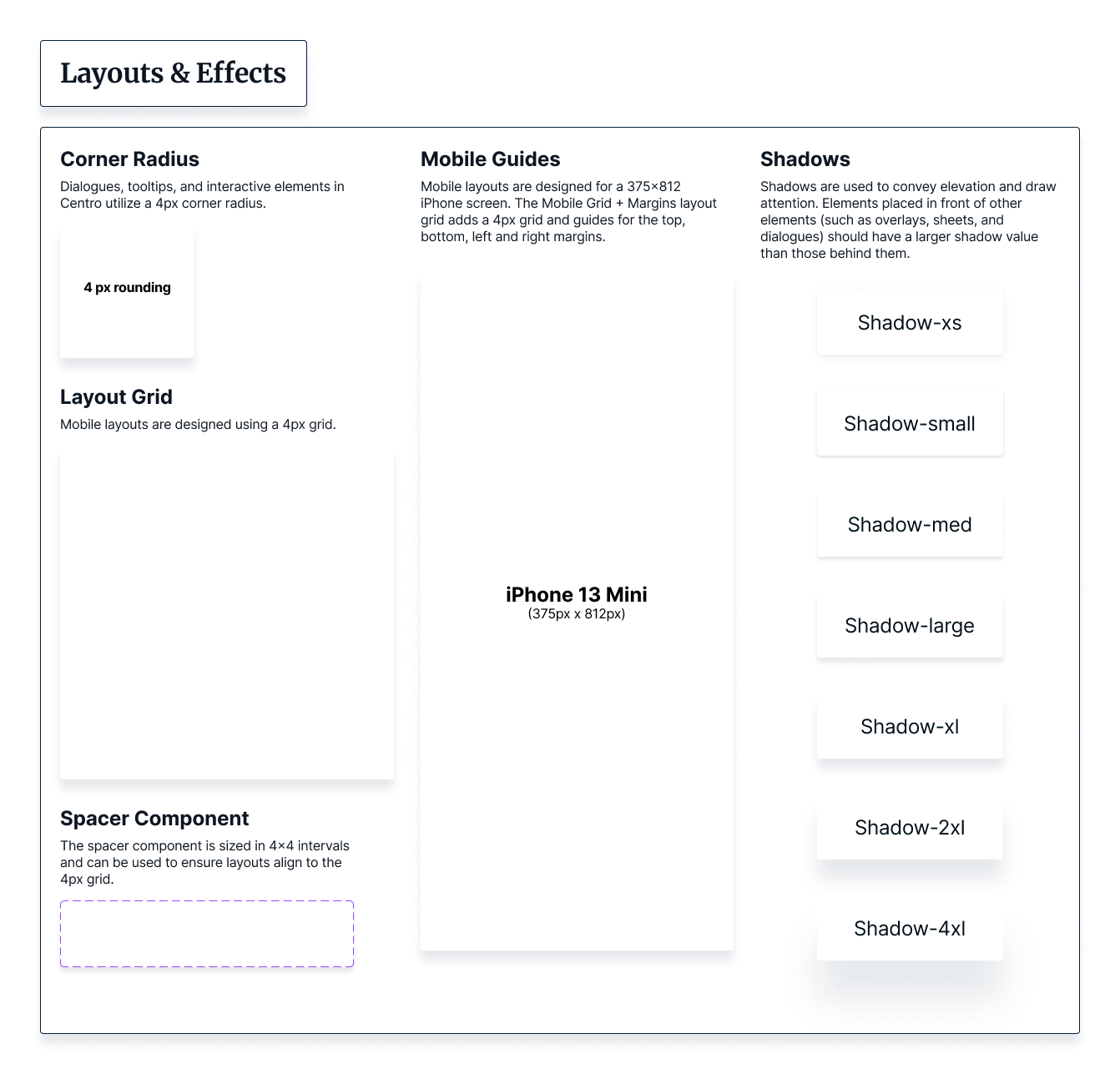
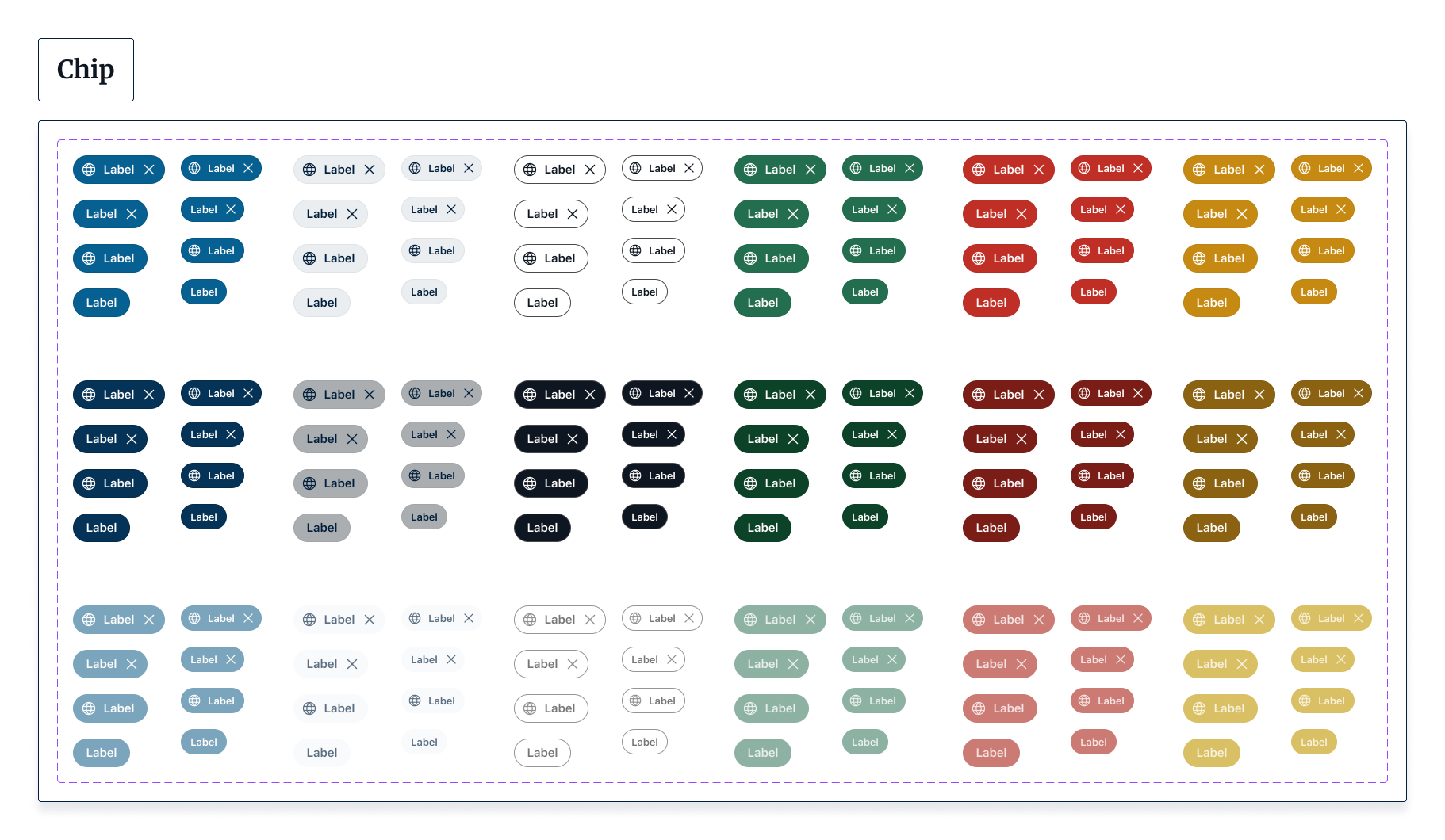
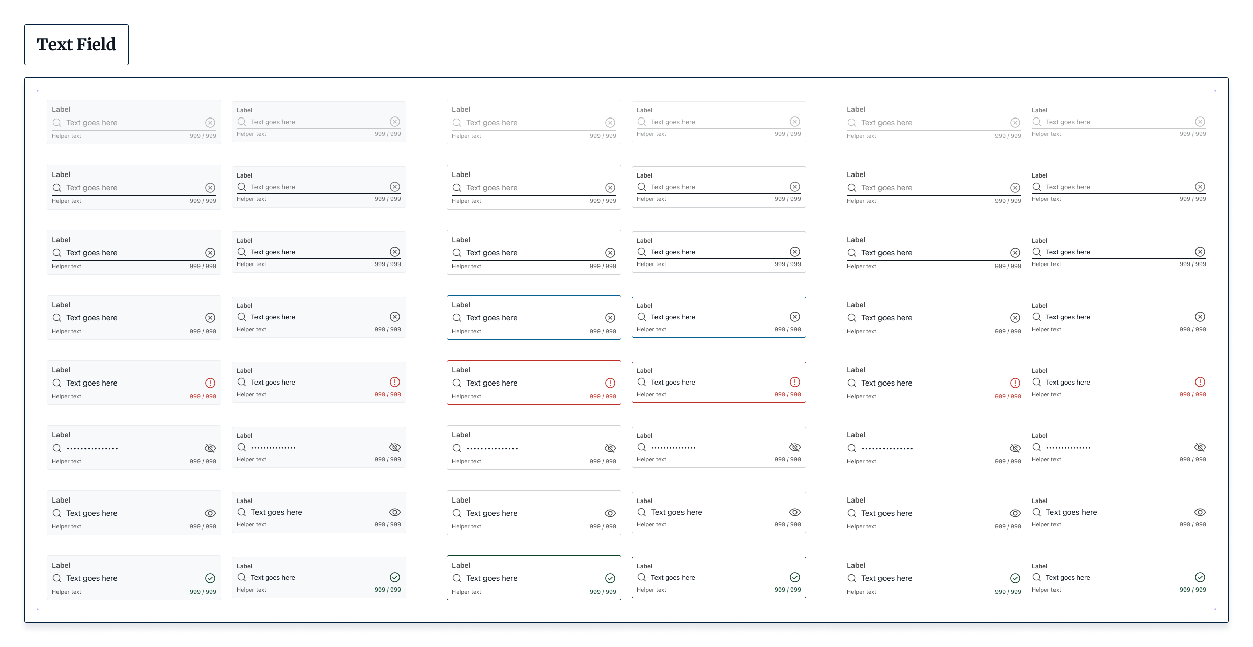
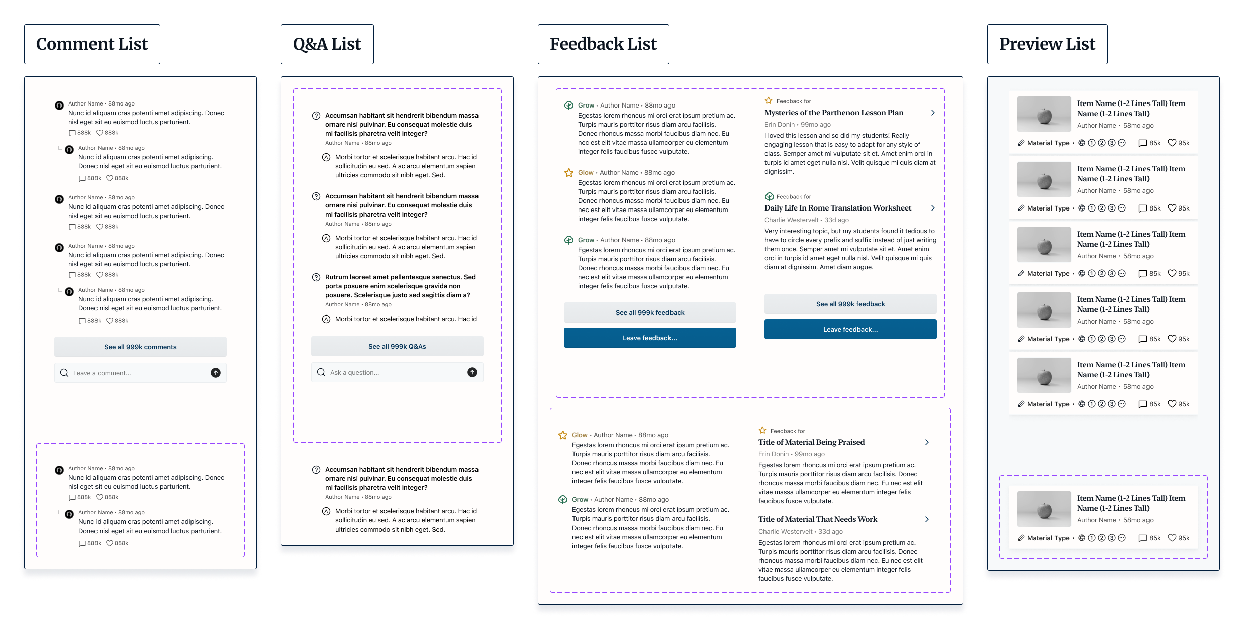
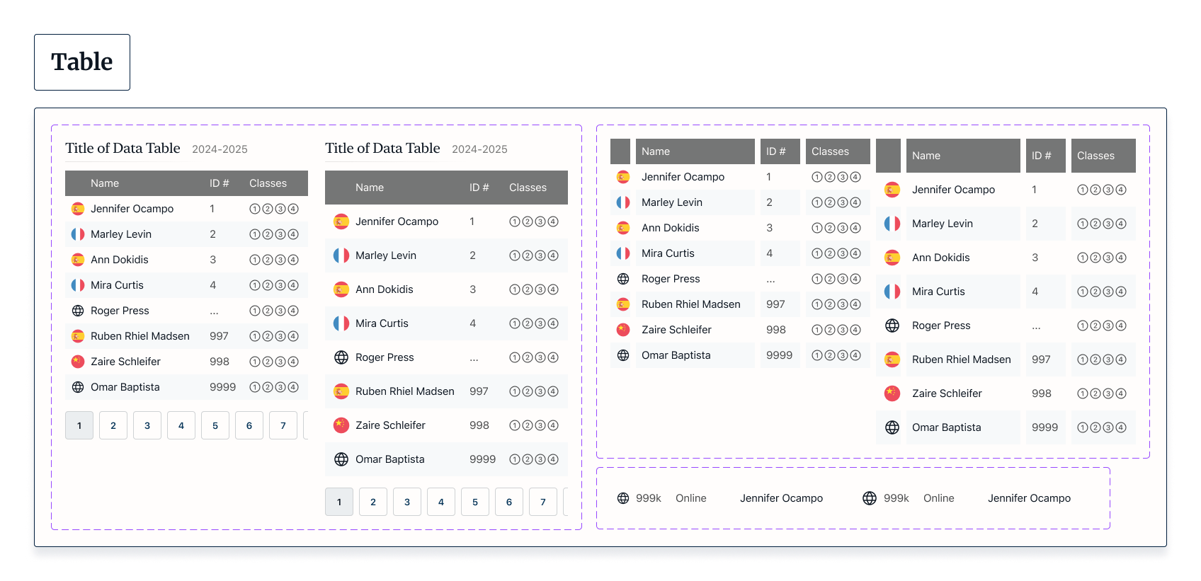
This approach revealed functional and perceptual patterns of the system as well as inconsistencies. I took notes on how I had already implemented each color, font size, and font weight to establish a concrete use case for each and then revised my designs to reflect these more consistent style guidelines. I also created new components, including sliders, tables, and toggles to add to the system's versatility.
An example of the interface inventory process where screens were broken down into their fundamental parts
Once the process of building out and organizing components was complete, I turned my attention to communicating the design system’s brand identity and purpose. Since my ultimate goal was to provide teachers with a central hub for supporting each other, I arrived at “Centro” as a name for the design system’s brand. Because the word centro means “center” in many Latin-derived languages, its connotations could be understood a wide audience.
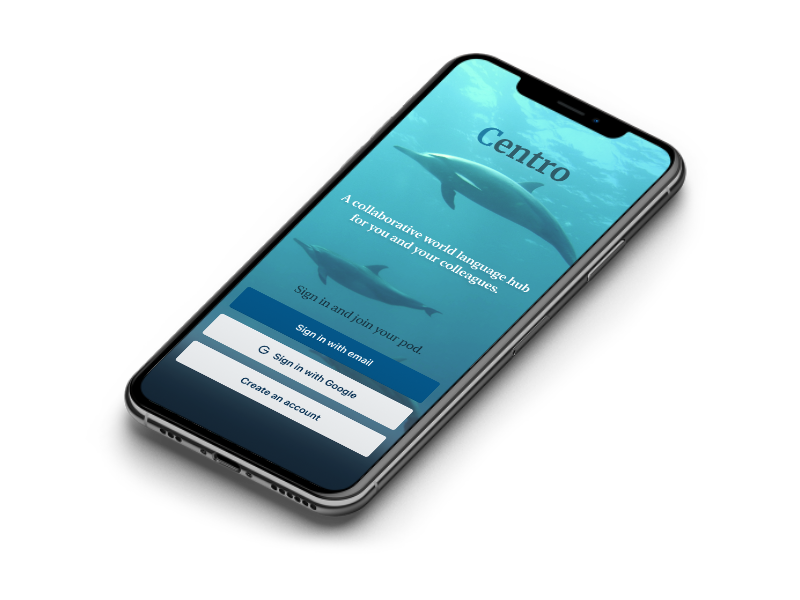
I chose the image of a dolphin for Centro’s logo because of dolphins’ advanced capacities for language and building supportive social connections - two qualities I hoped to foster through Centro. I designed a logo and wordmark by iterating on an image I prompted from Midjourney, refining it in Adobe Photoshop and Adobe Illustrator.
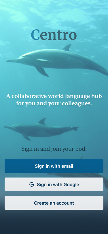
Logo and welcome screen
I formalized Centro’s design principles in writing, which had revealed themselves during the process of iterating on the design system. Returning to the initial goals I had established at the beginning of the project, I constructed concise statements of the design values that guide this project, and then included brief summaries of how those values could be applied in the future. Taking cues from Alla Kholmatova’s Design Systems, I wanted to ensure that Centro’s design principles were succinct and memorable enough to be adopted by anyone working with the brand.
Finally, I generated design tokens for Centro and uploaded the .JSON file to Centro’s Github repository. I provided a link within the Figma design file to ensure it was easy to access. After reviewing the design file a final time to ensure everything was working properly, I published Centro in the Figma community. View the finished design system below.
Centro’s design principles (click image to enlarge)
