Amplifire Case Study
Designing a mobile Q&A app to guide frustrated music producers
Project duration: 10 weeks
My roles: UX Designer, UX Researcher
Client: General Assembly
Brief: I was tasked with identifying a problem within a problem space of interest to me, conducting research and testing, and designing a high-fidelity prototype to demonstrate a solution. I designed a mobile application that would help beginner music producers resolve their frustrations by providing them with relevant solutions as quickly as possible.
Try the final prototype or continue on to read the case study
Problem statement:
When young adults in English-speaking countries interested in learning to produce music seek to use music production software, they face intimidating UI, difficulty troubleshooting problems, and an overwhelming sense of directionlessness. This causes them to waste time searching online resources for advice when attempting to use the software, depleting their creative energy and enthusiasm before they can begin to enjoy producing music. This problem impacts music production software companies by discouraging potential new users from engaging with their software.
Process and deliverables:
Research - User insights, affinity map, task analysis
Validate an approach - Solution sketches, feature prioritization matrices
Wireframe and low-fidelity prototype - Journey map, user flow, wireframe, low-fidelity interactive prototype
Conduct user testing - Moderated testing notes
Establish a visual style - Style guide
Develop a final prototype - High-fidelity interactive prototype
Reflect and look forward - Case summary
I designed Amplifire to help people experience the fun of producing music.
I know how fulfilling, creative, and fun it is to produce music using music production software (also called “digital audio workstations” - DAWs), but nearly everyone I’ve met who has tried to learn to produce music gave up within a few weeks or months. One of them put it like this:
“[Learning to produce music] feels like showing up to a new school and not even knowing the language.”
His frustration with learning how to produce music is far from unique. An informal field study of music production communities on Reddit reveals dozens of similar cries for help.
Why are so many people coming away from their attempts to produce music feeling helpless and depleted instead of feeling inspired and motivated? How might I help beginner DAW users feel confident in their ability to produce music?
With this question in mind, I led a project to design a solution. Across 10 weeks, I interviewed struggling producers, conducted research, iterated on solutions, and designed and developed a high-fidelity prototype.
My solution is Amplifire: a mobile application designed to offer frustrated music producers solutions to their problems as quickly and as accurately as possible. Amplifire allows its users to tag and categorize a frustration, receive tailored suggestions for help immediately, and reach out to a community for deeper, more specific answers if the procedurally-generated solutions don’t help.
Intro
Source: reddit.comResearch
Interviews made it clear that beginner producers often felt overwhelmed and directionless.
I began by conducting four 30-40 minute user interviews to gain insight into why so many beginner and intermediate producers were giving up before enjoying the fruits of their work. The interviewees’ experience levels varied, but three of the four participants were self-described musicians who had also attempted to record and produce their own music within the last year.
Julian
28-year-old Spanish Teacher
Aspiring chef and avid music fan, but has never tried producing her own music
29-year-old Bar Manager
Longtime guitar and piano player, just started recording his songs less than a month ago
27-year-old Data Consultant
Has tried and given up on learning to produce music several times in the past 8 years
photos changed to ensure privacy28-year-old Product Manager
Currently trying to learn music production for the first time, less than 6 months experience
Josh
Will
Mireia
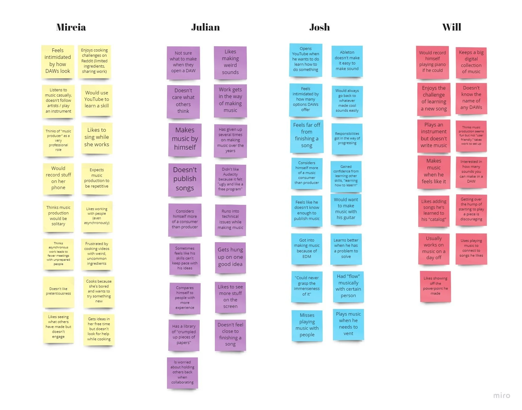
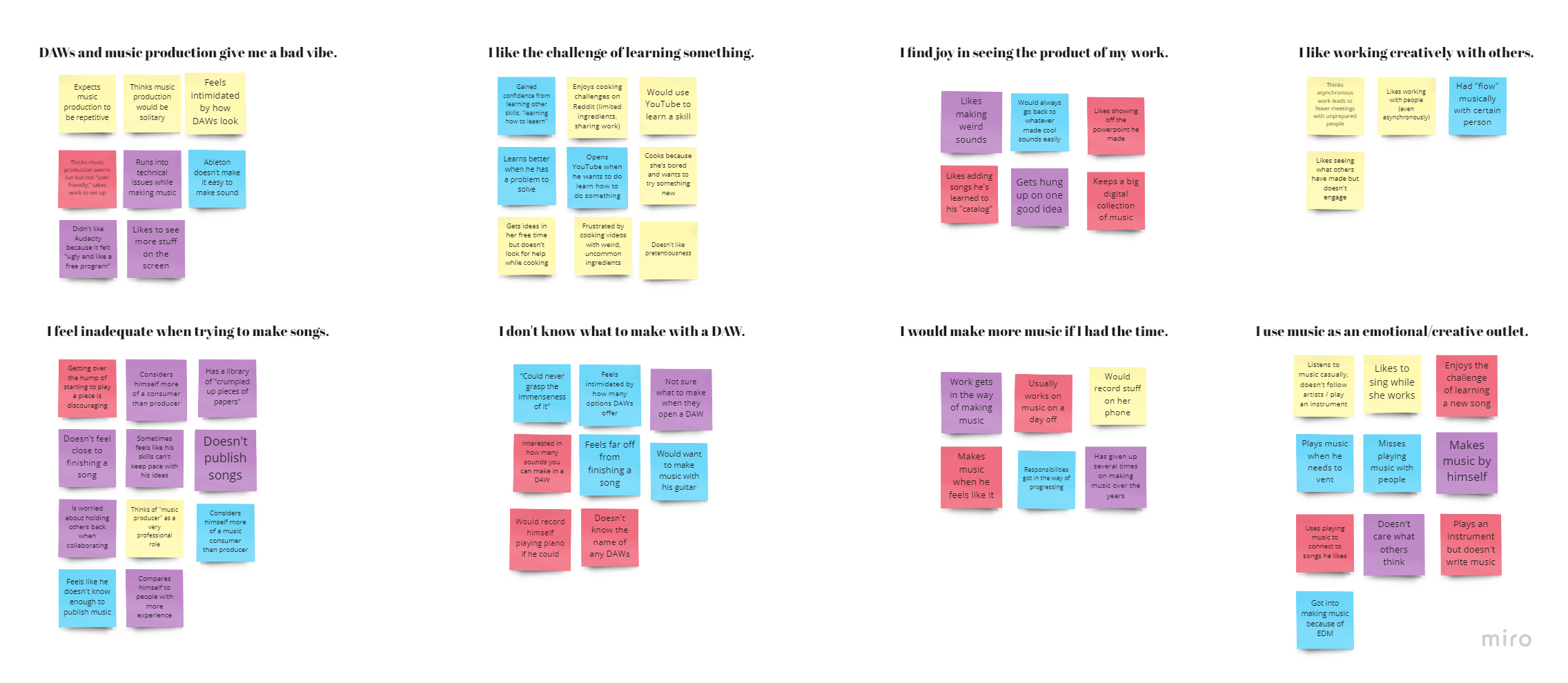
I then transcribed my insights from the interview process and created an affinity map in order to pinpoint the needs and frustrations of my audience:
User Insights
Affinity Map
Affinity mapping led to a number of insights. My interviewees were motivated by feeling progress and seeing the products of their creative work. They didn’t identify as “producers,” however, because…
👎 They found music production software visually intimidating.
👎 They never knew how to get started, given the wide range of tools available.
👎 They lacked the knowledge to overcome frequent technical or creative hurdles.
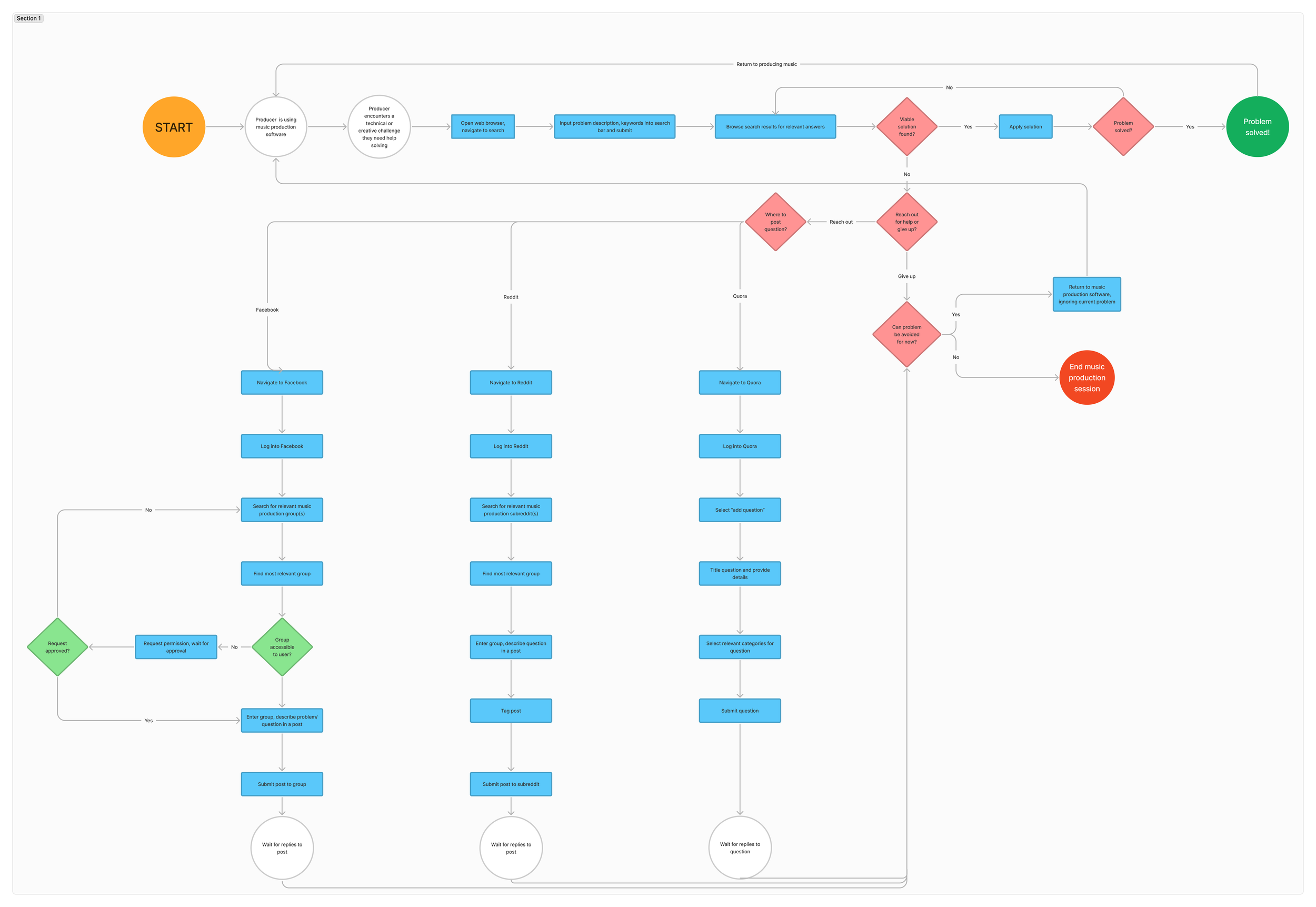
Task analysis - Click here to explore in Figma
Beginners also needed an easier path to overcoming their difficulties.
Given the variety of music production tutorials, documentation, and communities readily available online, I wanted to uncover why my interviewees were not getting the help they needed to keep them engaged. Three out of four interviewees reported that their primary recourse when encountering an issue while producing music was to conduct a Google search of their problem, usually leading them to similar questions on Reddit, Quora, or music production-related message boards. I performed a task analysis by diagramming how beginner producers get help from these online communities, pinpointing the pain points and potential areas for improvement.
I found that searching for music production help online was ineffective because:
If an answer wasn’t made easily visible on the first page of search results, then submitting a question to a message board required many more steps than simply ignoring the problem or giving up.
After posting a question online, frustrated producers may wait hours, days, or even weeks for a helpful reply to arrive.
Potential answers could be spread out among any number of music production-related sub-groups within an online community. A frustrated user may have to re-post the same question within several groups in order to get a satisfying answer.
With this in mind, I ideated two potential directions our solution might take:
B. Create a central source for music production help that provides answers quickly. This avoids having producers waste energy by sifting through search results only to give up.
or
A. Help beginners build confidence by finishing songs without outside help. Seeing steady progress would keep them engaged and demystify the process of music production
I proceeded to explore solutions with the following question in mind:
How might we help beginner music producers overcome their frustrations and feel confident in their ability to produce finished songs?
Validating an approach
Developing more approachable software didn’t appear feasible or effective long-term.
The first solution I chose to explore was providing an approachable, simplified digital audio workstation (DAW) that would build confidence in struggling producers by:
Streamlining the UI that often lead to confusion in professional DAWs
Omitting features that weren’t essential for beginners to complete a song
Encouraging producers to regularly complete and share their songs
I intended to focus on creating a positive association with music production that would compel beginners to keep learning to produce, even when confronted with challenges in their DAW of choice.
Besides that, I’m fascinated by how different DAWs facilitate the complicated, often abstract process of making music through their distinct UIs, so designing a solution via this approach intrigued me. I sketched out some ideas for what this “DAW-lite” might look like.
Approach A - Mobile DAW
Solution 1: A basic mobile DAW that lets people assemble a song through premade clips, review it and add notes with what they’d like to change, execute the changes, and publish their finished song.
Solution 2: A mobile DAW similar to my first solution . Producers would record an idea directly onto their phone, pick from premade stems to accompany their recording, and assemble it all into a finished song.
Solution 3: A mobile DAW with an emphasis on recording your own musical ideas in short clipsand sharing them for others to use. The recordings would be tagged with their BPM, genre, and instrument in order to make them easier to discover by other users. Producers could assemble songs using their own recordings and those of other users.
Solution 4: Like solution #3, a mobile DAW that would encourage producers to record and share musical snippets to be used in others’ songs with a greater emphasis on social features and keeping the songs brief and easily shareable. Producers could also see what snippets were used in other users’ songs and add them to a collection for later use in their own songs.
To provide a compelling music production experience, several complex features would have to be implemented in a minimum viable product. I mapped out the features in a feature prioritization matrix and found the following:
Designing and developing a mobile DAW would require a significant amount of effort just to reach the minimum viable product.
With this approach, my effort would be split between designing the social features and the DAW itself, which is not ideal for either.
Extra attention would have to be paid to user retention - if the app is successful in building confidence in beginners they’re likely to move on to a more professional DAW.
Besides the above, I also believe that many beginner “issues” - complicated UI, trouble finishing songs, lack of direction, etc. - stem from the most compelling aspects of music production. I find that working in a DAW is fun because it offers a near-infinite number of possibilities at your fingertips, and the UI is often necessarily complex to reflect that. Experimenting with different solutions often leads to creative breakthroughs. To remove these core elements of music production in service of a more simplified experience deprive producers of its greatest rewards. I moved on to sketching another solution.
Feature prioritization matrix for Approach A, a streamlined mobile DAW
Instead, helping producers troubleshoot quickly keeps them engaged and builds confidence.
Analyzing the root cause of my interviewees’ frustrations led me to a conclusion: frustrated music producers’ fundamental goal was simply to make music. While learning production skills and building confidence are important for long-term success, they’re ultimately in service of allowing producers to create music they are proud of. My design goal could be to help producers overcome the variety of obstacles that crop up in a production session in order to keep them on the track to maximum creative output. Surely, seeing the product of their creative work would motivate and build confidence in struggling producers as well.
Thus, my next solution sketches focused on alleviating the tedious process of getting help as a frustrated producer. I sketched out two possible solutions.
Approach B - Progress Tracker / Help Center
Solution 5: A mobile application that encourages producers to set goals for each song they are working on and track their progress. Producers can receive procedurally-generated suggestions (based on the wording in their stated goals) for how to proceed when they are stuck.
Solution 6: A mobile application that helps producers describe and tag a problem quickly, then receive procedurally-generated strategies for how to overcome their frustration. If the generated suggestions don’t help, people have the option of reaching out to a community for answers and helping others while they wait for replies.
I found the Q&A center solution in my second sketch to be more compelling than the progress tracker approach, so I mapped its potential features on a feature prioritization matrix to evaluate its feasibility.
The quantity of high impact, lower effort features I could implement boded well for achieving a compelling product in the remaining eight weeks of my timeframe, so I decided to proceed to exploring user flows for my solution.
Feature prioritization matrix for streamlined Q&A app
Before wireframing my chosen solution in Figma, a few questions needed to be answered. At what point in the production process would my solution be most effective? To the average frustrated producer, what would differentiate it from other resources currently at their disposal? And what could we do to leave a positive impression even if they don’t receive help right away? I plotted out how this solution might used by a beginner producer through a journey map.
Journey mapping highlighted the pain points I would address in the primary user flow.
User Journey Map
These were my key findings from journey mapping:
Successful onboarding is crucial, as producers are likely to come to this app already in a state of frustration. They need to feel reassured, knowing that help is on the way soon, and therefore see the value in proceeding to register and submit a frustration for help.
Submitting a frustration should be as quick and painless as possible. If a producer gets bogged down in the process of describing and documenting their problem, their frustration could grow, and they may be disappointed if the procedurally-generated suggestions don’t alleviate it immediately.
Producers need a compelling reason to help solve others’ frustrations. A positive experience submitting a frustration could lead a producer to want to give back to the community by leveraging the design pattern of reciprocation, but other incentives (such as collectible achievements or a social reputation system) were worth considering as well.
Next, I took these findings into consideration when diagramming user flows.
User Flow Diagram
I received some valuable feedback when presenting this primary user flow to stakeholders. In particular, they encouraged me to consider when it was necessary for users to create an account, as well as what potential features could be implemented to generate revenue, such as the option to pay a premium to ask a music production expert directly. Stakeholders were also pleased by the potential help this service could provide to music software developers by gathering data and insights on pain points and technical problems.
With a more concrete vision of how the service would work, it was time to wireframe the steps of my user flow diagram and see how it would work in higher fidelity.
Designing a Solution
Wireframing taught me new tools and how to better prioritize functionality over style.
When turning my user flow into a wireframe, I prioritized demonstrating the primary and secondary user flows of getting help with a frustration and answering a community question. I went directly into wireframing it in Figma, as I wanted to gain more fluency in the software.
This being my first experience wireframing in Figma, it took some time to achieve the designs I was looking for, but I found the software intuitive and fun to use due to some UI similarities with Adobe Creative Suite products. Consequently, my desire to make it visually pleasing and test out the toolset led to a lot of experimentation in visual design. In retrospect, focusing on simplicity and visual clarity would have allowed me to iterate more quickly and consider more possibilities before settling on a design for my prototype. Still, I explored several wireframe designs and came away confident in the results.
Wireframe
Using the wireframe as a base, I created a low-fidelity prototype by adding interactions, animations, and improving on the visual design of some UI elements such as the navigation bar.
My main considerations were the following:
To help first-time app users understand the flow of the submission process, it was crucial to highlight the difference between receiving automated answers provided by the app versus the process of submitting a question to the community. I opted for breadcrumbs in the form of a header that displays the current step in the main user flow.
To reassure and avoid intimidating beginner producers, I incorporated a conversational, friendly tone in the copy and large, rounded UI elements.
To encourage producers to answer other users’ questions, I attempted to make other peoples’ questions visible by including a “recent questions” activity stream on the home screen. Remembering the feedback I had received on my user flow about the psychological principle of reciprocity, I also directed users straight to helping others immediately after solving their problem. Lastly, I included collectible achievements on the user profile page as a basic means of letting users show off their contributions to the community.
To provide procedurally-generated solutions that help, I required producers to tag and describe their question first. My intention was to accumulate as much metadata as possible about a question to ensure that the procedurally-generated solutions we provided were relevant. Since a precise answer to the question couldn’t always be guaranteed, I chose to offer oblique solutions as well, inspired by Brian Eno and Peter Schmidt’s Oblique Strategies card deck. I wanted to encourage users to test out a variety of solutions before continuing, so I included modal checkboxes by each solution but did not require them to be checked in order to progress.
Low-fidelity prototype
Testing the Prototype
User testing showed where better signifiers could make getting and giving help easier.
I conducted three 15-20 minute moderated tests of my low-fidelity prototype, each test consisting of tasks that covered the primary and secondary user flows:
Starting from home screen, submit a question to the community
Starting from home screen, respond to another user’s question in the community
To give context to the tasks, each user was given the following scenarios:
“Imagine you are working on a song in your music production software of choice. Things are going great until you hit a snag: the melody you recorded sounds great, but you can’t seem to create a satisfying drum pattern to accompany it. You remember that a friend has told you about an app that helps beginner music producers when they need help overcoming a music production-related issue. After downloading the app, you open it and attempt to receive help with your problem.”
After completing Task 1: “Soon after submitting your question, you return to the home screen. As a beginner producer, you want to see what frustrations other music producers are experiencing, and to offer up any expertise you have. You attempt to browse other users’ questions and find one to respond to.”
I took a screen and audio recording of each test and later reviewed them while taking notes. I kept a record of user errors, hesitations, time taken to complete each task, and which tasks were successfully completed.
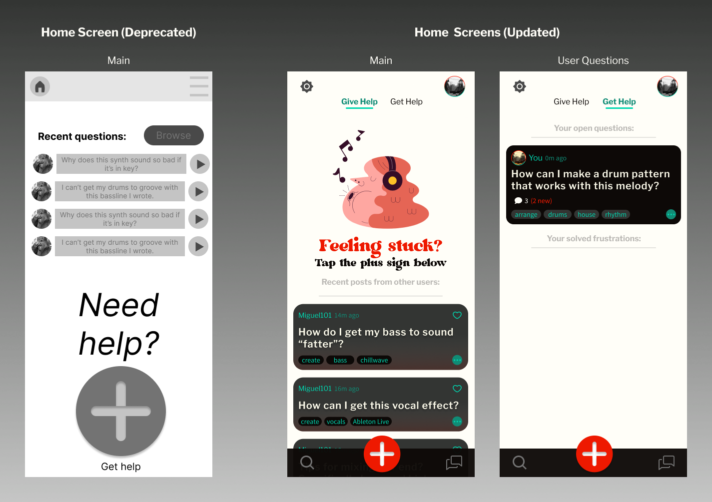
(1) The home screen was in noticeable need of an overhaul. Firstly, the ambiguous “recent questions” section confused testers, as it was unclear whether the questions were submitted by them or other users. The “more” UI element to the right of each question indicated a “play” function instead of “more,” leading to several misclicks. The browse button, currently the only way to reach the community screen, was difficult for testers to find, perhaps due to its size, placement, and low contrast ratio.
(2) Despite its large size, the purpose of the get help button at the bottom wasn’t immediately clear to testers. This could be due to ambiguity - the text above says “get help,” but the plus symbol implies adding or submitting. Some also commented on how awkward it looked taking up so much screen space. This home screen design limited the number of recent questions and to omitted important information like tags, which did not serve my goal of encouraging users to explore and answer others’ questions.
(3) Testers seemed to enjoy the scrolling card format when browsing the community questions. However, the repeated placeholder elements and copy text led to confusion when trying to select a question to answer. While I planned to vary the questions in my higher-fidelity prototype, this made it somewhat difficult to reliably test how users would find and answer a question.
(4) The button to view question details and offer help was misleading, due to its lightbulb icon and text that implied some kind of customer support feature instead. Testers usually pressed on the center of the card to expand it anyways.
(5) Testers didn’t find it intuitive to choose which step of production they were on, especially because it was at the beginning of the question submission process. This was indicated by two testers pressing the I’m not sure button at the bottom of the page almost immediately. They attributed this primarily to the choice of categories themselves, which were too ambiguous for beginner producers, and how devoting a screen to this selection may have over-emphasized the need to choose correctly. This ran counter to my goal to avoid intimidating new users.
(6) Lastly, testers were not 100% clear on how submitting a question worked, despite notification screens and header text that was meant to serve as breadcrumbs. After solving a problem via the procedurally-generated suggestions and receiving a confirmation message, one tester was still unclear whether the question had been submitted to be answered by the community as well. Others were unclear how the provided solutions were being selected, implying the connection between categorizing a submission and receiving help wasn’t clear enough. Addressing this confusion was a high priority, as it directly affected the primary user flow.
Establishing a Visual Style
I focused on style and branding that would inspire calm, confidence, and creativity.
When homing in on an brand identity for my app, I first searched for a music or music-production term to use as a name that would align with my solution. I wanted to imply a sense of both relief and empowerment, since beginner music producers could now overcome their problems and experience the fun of producing without the stress of constant difficulties.
At first, I settled on the name Lossless, an adjective used to describe uncompressed audio. I thought it would imply that my audience would no longer consider their frustrating production sessions as “losses,” since they could always reach out for help. Instead, several stakeholders with whom I shared this name found it overly negative-sounding (one even remarked that it would fit better as a name for a bereavement therapy app). I changed the name to the more positive Amplifire, a play on the word “amplifier,” a more well-known term for an audio device that increases the power of an electronic signal. I imagined my audience “amplifying” their questions to be heard by the community, with the play on words also emphasizing their burning drive to unleash creativity. I subtly highlighted this double meaning in my logo as I developed a style guide for my app.
Style Guide
Color Styles
To come up with an color style for my app, I returned to my affinity map and interview notes. Because my audience is often intimidated and confused by the appearance of professional DAWs, I focused on distinguishing my brand with brighter and more encouraging colors.
I chose a warm off-white color as a neutral base, and experimented with applying different colors to my homepage. I settled on shades of dark and bright teal for the primary and secondary colors to reinforce a sense of calm and rejuvenation.
In order to draw more attention to important interactive UI elements, I explored colors complimentary to teal and decided on an orange highlight color in my design. I took care to use the orange highlight color sparingly, as to avoid ambiguity about green and reddish orange elements implying success and error states (respectively).
Typography
Inspired by the playful and positive visual style of 60s psychedelic music posters, I chose a chunky retro font for my logo and large main header text (Dubbo Black 32pt).
Because my large header font was especially attention-grabbing, I chose a more understated and versatile typeface, Libre Franklin, in semibold 20pt for smaller headers and in regular weight 16pt for body text.
Keeping small text in the same typeface as body text led to issues distinguishing between the two, so I elected to change my smallest font to Source Sans Pro Regular 14pt.
In keeping with my goal to provide an approachable resource for beginner producers, I opted for many rounded UI elements to make them appear more unassuming.
To further highlight the difference between submitting a question and reading a submitted question, I styled question cards with a dark background and light text in contrast to the light appearance of the home screen and question submission process.
Component Styles
Building the Final Prototype
Adding a card UI to the prototype improved consistency, navigation and readability.
When redesigning and improving the fidelity of my prototype, the single most impactful choice I made was to implement a card system for submitted questions throughout my app. This had the following effects:
Cards provided a base for the UI redesigns I made to several screens and helped maintain consistent spacing and design throughout.
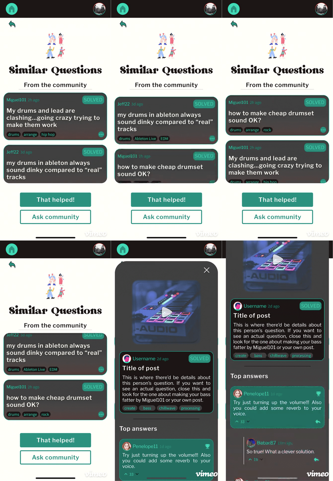
Cards made it more clear when a question had been submitted to the community (addressing one of the issues encountered during user testing), as questions only appeared as cards after submission or immediately before that while being reviewed. This also helped distinguish procedurally-generated suggestions from suggested similar questions from the community.
The ability to expand cards as overlays made it easy to quickly view more information about a question without navigating to a new screen, simplifying the question answering user flow significantly.
Home
Community
Submitting a Question
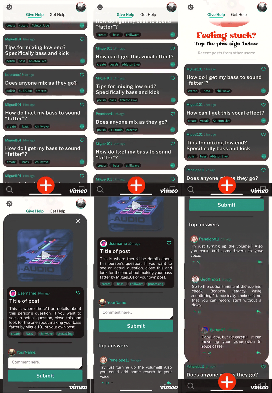
Question, home, and community screens were redesigned with cards in mind.
Nearly every screen in my prototype was reworked in one way or another, with the home, community, and question submission screens seeing the most dramatic changes. I improved their visual styling, streamlined navigation, and added various features to each.
Updated Home Screen
Feedback from user testing indicated several problems with the layout of the home screen in the low-fidelity prototype (mentioned earlier), so I reorganized the elements to make it easier for users to answer and submit questions. Some notable changes:
Divided the home screen using parallel Get Help and Give Help tabs to clarify the distinction between checking other users’ questions and own questions.
Implemented expandable card system in Recent Questions activity feed to enhance visual clarity and allow users to answer questions without navigating to community section.
Added animated art and call to action to encourage users to submit question
Updated Community Section
While implementing question cards throughout my redesign, I focused on including more white space to reduce visual clutter. I also added a number of features to make it easier to browse and find questions:
Added Browse by step section, allowing users to sort questions by which phase of music production they apply to
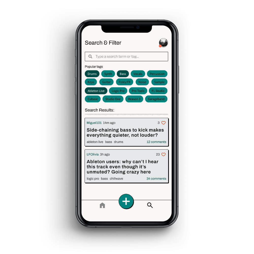
Added Filter by tag feature with suggested types of popular tags
Added question search feature, also accessible via bottom navigation bar
Updated Question Submission Flow
As the primary user flow of my app, the process of submitting a question saw several changes based on feedback from user testing. I focused on making the process more efficient, with fewer interruptions and more condensed layouts:
Consolidated all parts of describing and tagging a question to one screen to streamline primary user flow
De-emphasized tagging each question with a production step. While this feature was helpful for generating solutions and categorizing questions, I didn’t want to overwhelm people as it did in testing
Added popup explanations of auto-generated suggestions to provide more detail and help beginner producers
Prompted users to create account on first launch instead to avoid interrupting question submission flow
Added walkthrough on welcome screen to explain app purpose and question submission process
Additional Improvements
To improve the fidelity of my prototype, several other changes were made throughout. These primarily involved adding interactive features to flesh out the social aspect of the service, and including more art and animations to make the app more pleasant to use:
Implemented style guide elements, making UI more legible and appealing
Added ability for users to open and comment on another user’s post, as well as to award a best answer for their own question
Added navigation bar, allowing users to navigate directly to community section or submit a question from most screens
Added animations for screen transitions and some decorative elements
Added ability to view user profile pages
High-Fidelity Interactive Prototype
Reflecting and Looking Forward
I’m excited by the ways Amplifire could be developed and expanded upon.
Looking forward, I have several ideas for what would make Amplifire an even more appealing product to stakeholders. Here are a few:
Expand social features to further incentivize participation
This could include gamifying the question answering process with an experience system, collectible achievements, and a more customizable user profile screen
Improve upon the information architecture
Ensuring the procedurally-generated suggestions are helpful requires more expertise in how this system could be developed on both the front- and backend.
Recruit users with specialized experience
Having users with experience in niche software or production skills would help to ensure more questions receive satisfying answers.
Add a glossary of music production terms
Allowing people to select a term found in a question or answer to bring up a definition immediately would allow beginners to more easily participate in helping others.
Offer premium services
This could include the ability to send a question directly to an expert, more user profile customization options, or accessing additional procedurally-generated suggestions.
I learned valuable lessons about organizing my workflow and testing often.
Looking back, I would have done a few things differently while designing Amplifire. Two things stand out to me the most:
First, learning Figma as I developed the prototype led to a slower workflow that yielded some less-than-ideal UI design. With best practices in mind and a great deal more experience now, I would have adhered more closely to a layout grid and maintained a more organized library of assets to ensure my design was more consistent and pixel-perfect. Learning the Figma workflow took some of my focus away from the design process itself, so I believe I could achieve better results in significantly less time now.
Second, I would have liked to conduct more research with a wider variety of participants and test more regularly throughout the design process to better inform my design decisions. Time constraints limited the number of stakeholders I was able to interview at the beginning of my design process, which I would have preferred to include more beginner and intermediate music producers of more diverse backgrounds. Due to technical issues with the platform I used, unmoderated testing of my medium-fidelity prototype also led to very little usable feedback. In general, I think some of my design revisions could have been avoided if I had more qualitative and quantitative data at each step of the process.
I’m glad my stakeholders were pleased by this design and its demonstrated value.
Overall, I am happy with the results of my design process, and grateful for the many lessons I learned along the way. The final prototype demonstrates an efficient solution to my initial problem statement, providing frustrated music producers with an easy-to-use, beginner-friendly resource for quickly overcoming any type of music-production-related challenge.
With a few changes to the UI and tags system, the design of this Q&A-style service could also be adapted to help with learning nearly any hobby or skill. Providing a centralized resource of strategies and user-submitted answers would be just as valuable for, say, gardening or car repair as it would for music production. While my passion for music production runs deep, I’m pleased to have designed something that could benefit frustrated hobbyists in any field.
Update 10.20.23 - Redesigning Amplifire
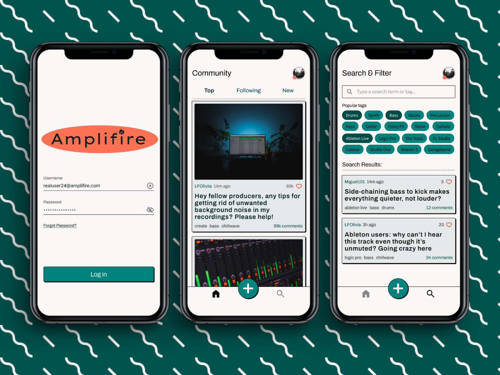
As an exercise, I recently returned to the Amplifire prototype to reimagine its design language and layout. I wanted to try applying the design skills I’ve developed across other projects since designing Amplifire and to see how the app might look with a more modern, neo brutalist style. I created a web mockup in the new style as well, as I was curious how its design would transfer to a desktop interface.
To stay competitive with modern Q&A solutions, I envisioned Amplifire offering AI-based help as well as community answers. Licensing the power of LLMs such as ChatGPT could allow frustrated producers to find satisfactory answers almost instantly, while still allowing users to post questions to the community if they prefer.
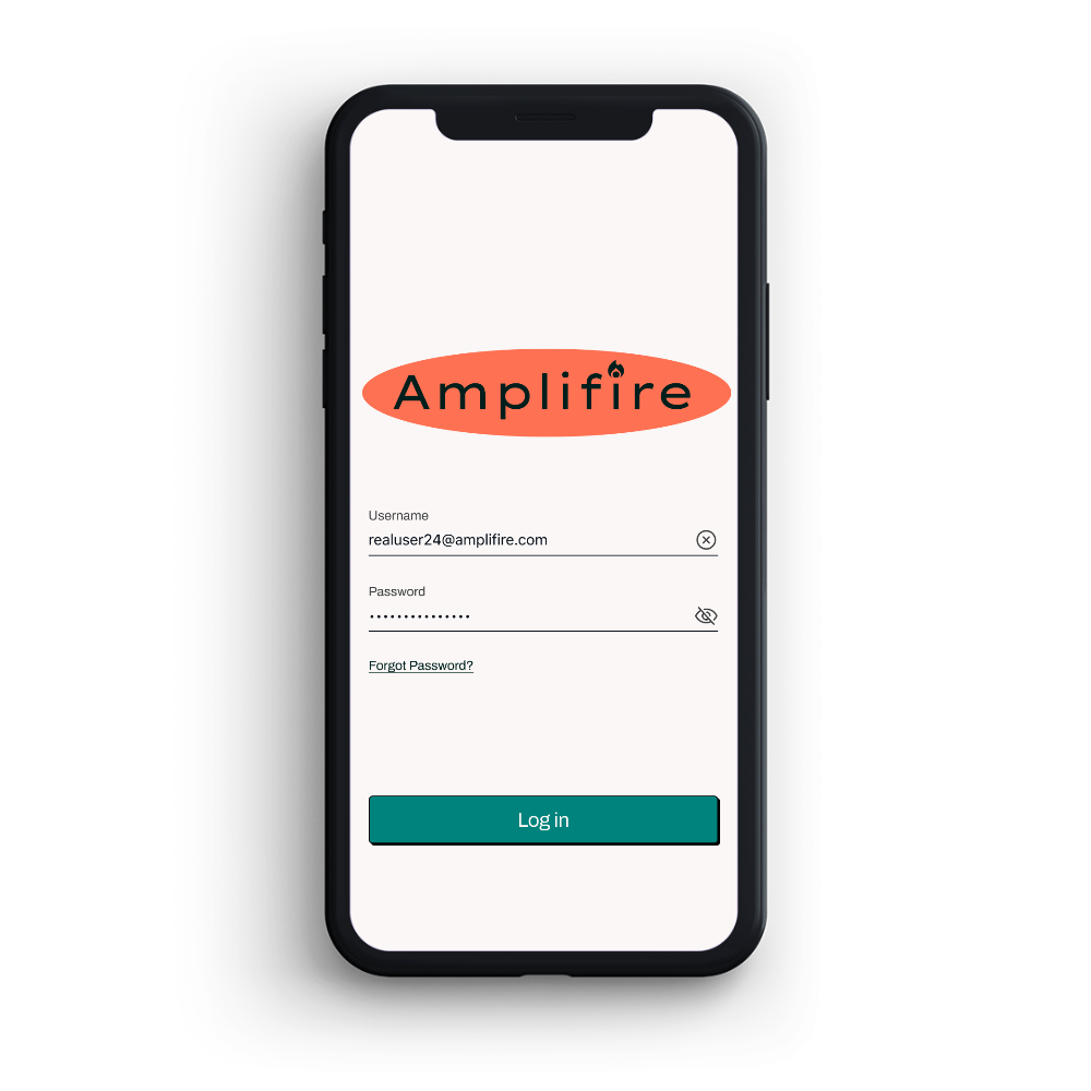
See examples of the redesigned web and mobile app below.
